Brainstorm 2
What's the best way to help users find third-party products?
The following issue to address is how to improve the experience of finding products users are looking for. I carried out some explorations to hear feedback from the team.
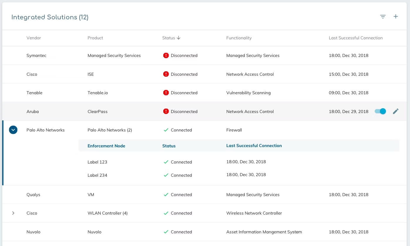
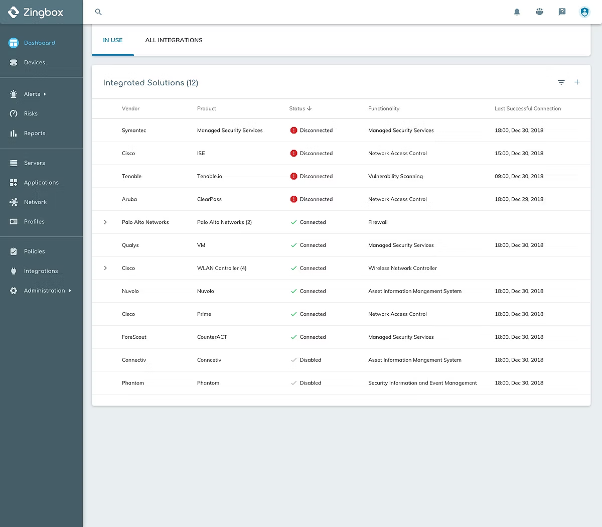
Exploration 1 - Reuse old style
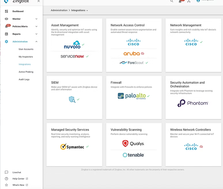
After discussing with the product manager, I realized that from a business point of view, we still need to have an individual space to display all the products we can cooperate with, showing that we are increasing our capability by caring customers' needs and growing to a powerful platform.
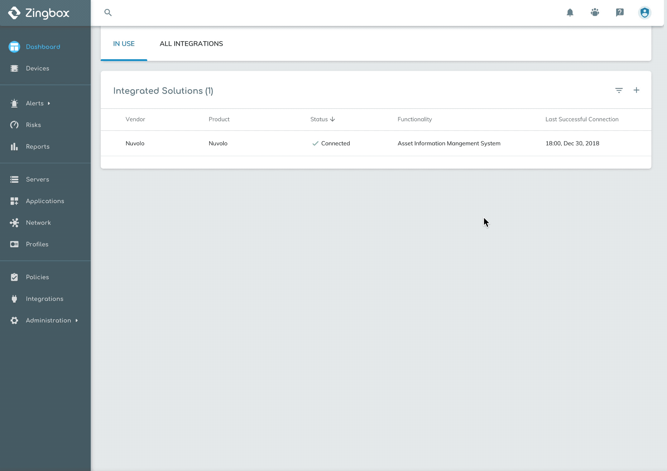
So hiding the whole list under the in-use table wasn't helpful to convey this important message to our clients.
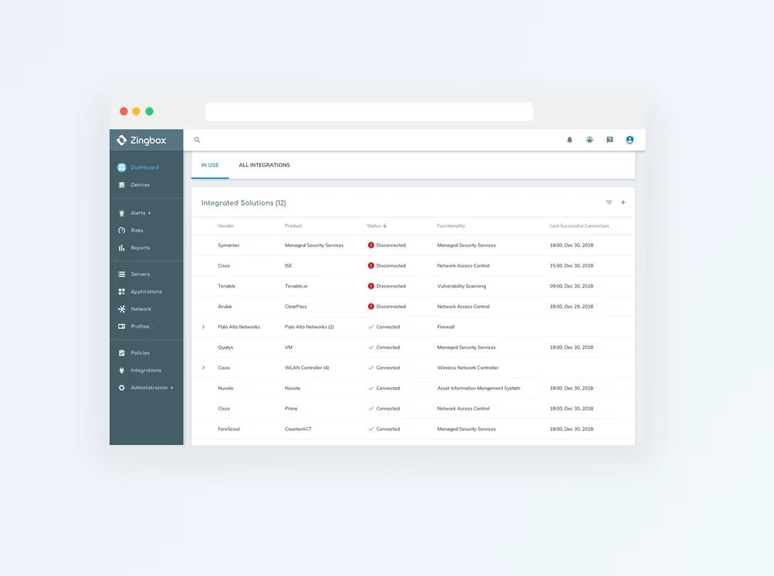
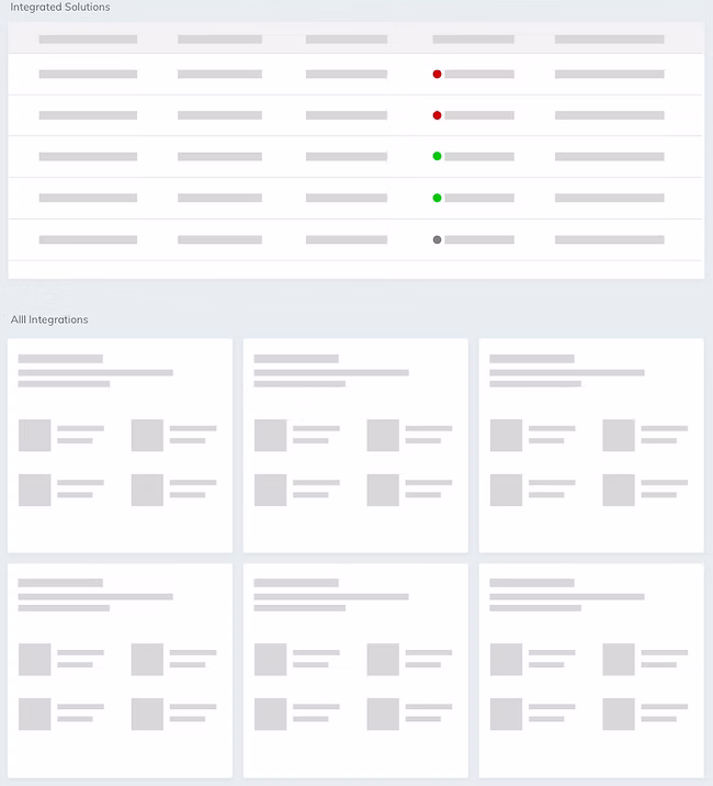
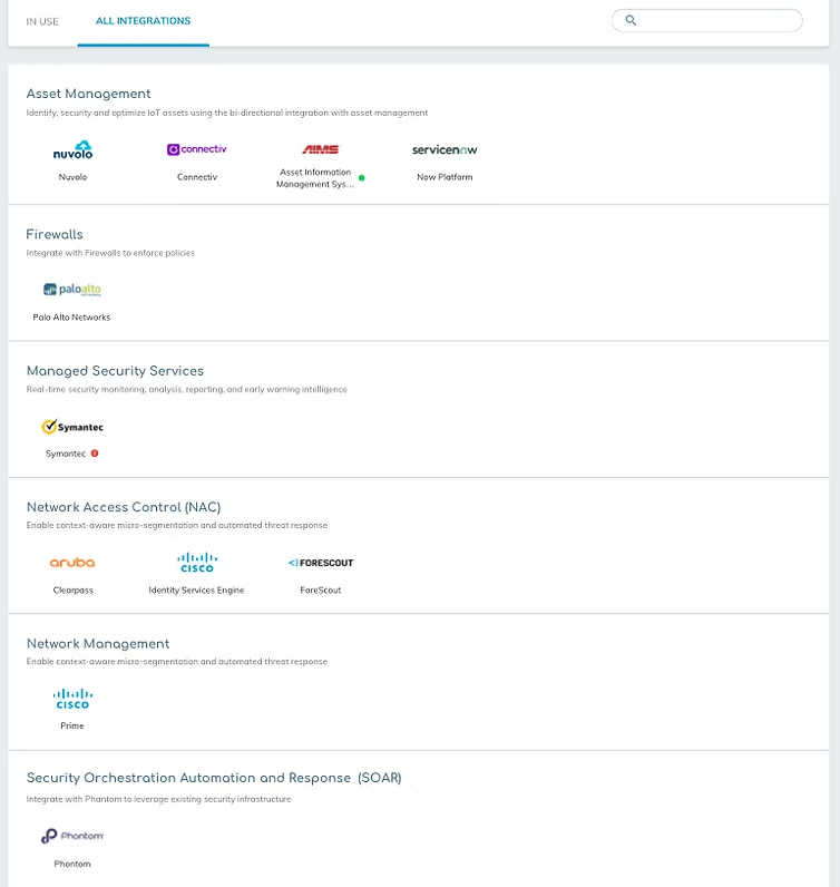
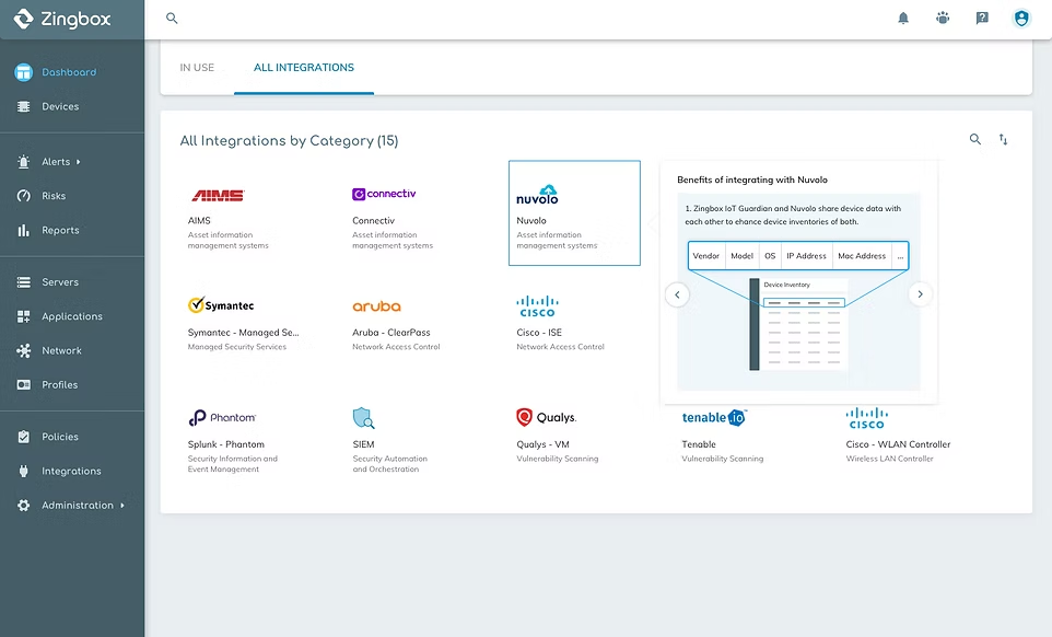
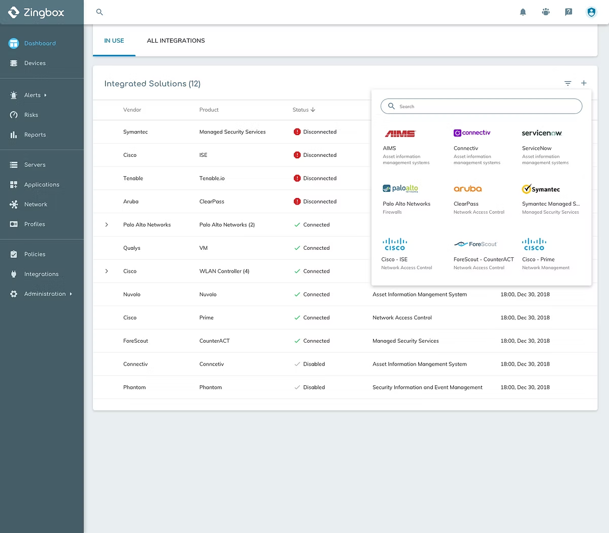
Exploration 2 - Introduce 'Tab' into this page
This time, I separated the In-use Table and All Integrations into two tabs. By this way, users were able to have a clear vision on both configured integrations and all available products.
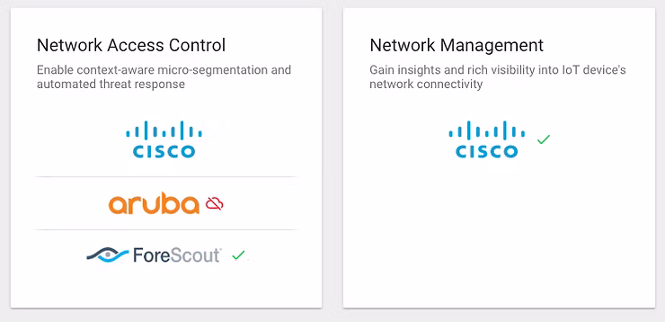
Looking at the current layout, I asked myself: Is this the best way to group integrations? Is this grouping helpful for users to find what they are looking for?
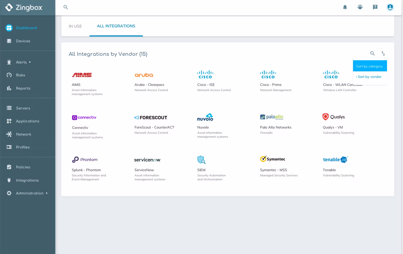
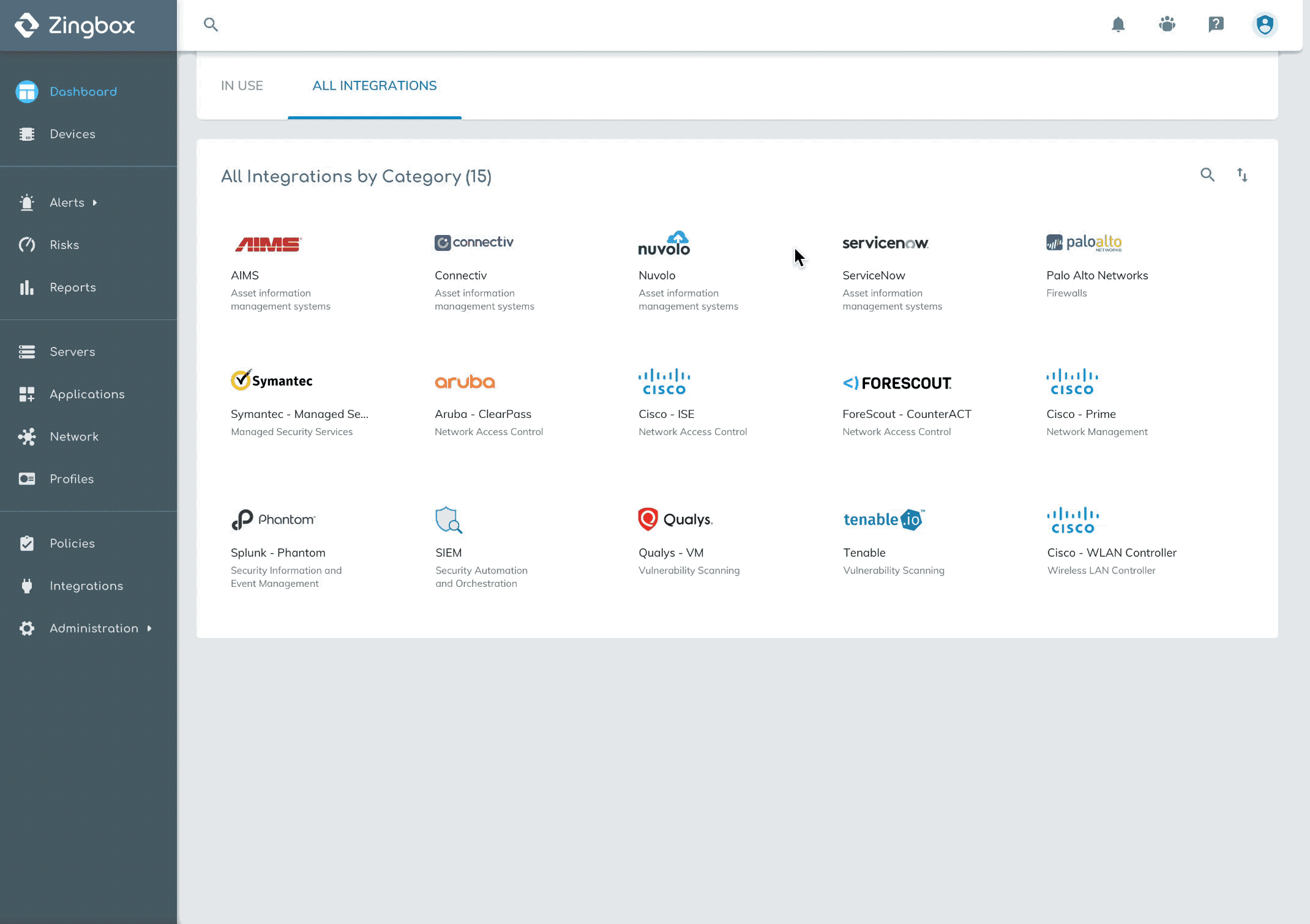
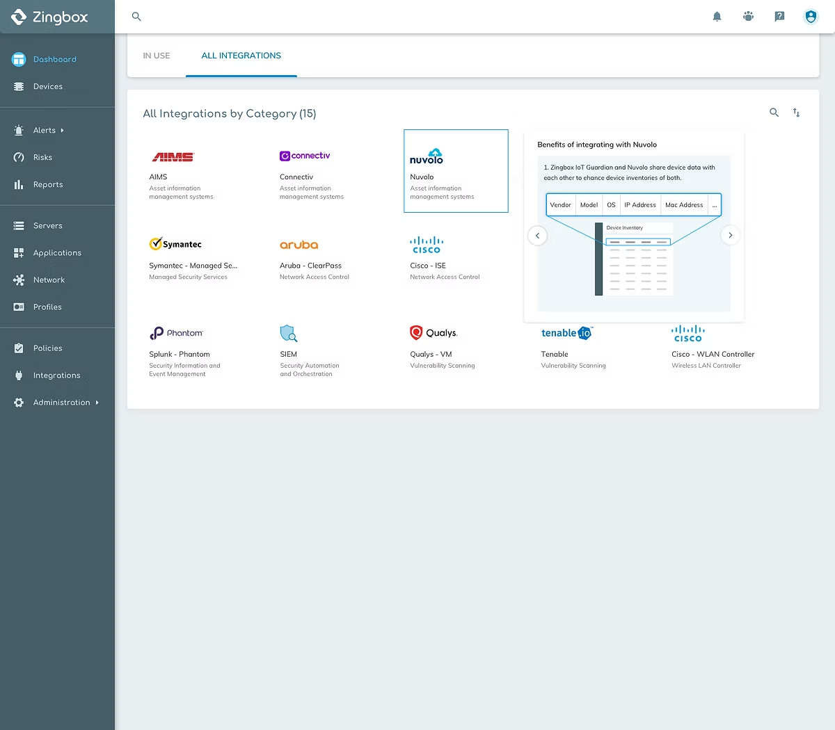
Solution - Break grouping, let users sort and search
Compared with the terms defined by us for grouping, vendor name or product name should be the first reference the user could recall when thinking about a product. I decided to alphabetically sort products by vendor name. When the list becomes longer later, users still can have a sense of the approximate location of the products or just search them. At the same time, users are also able to sort by categories.